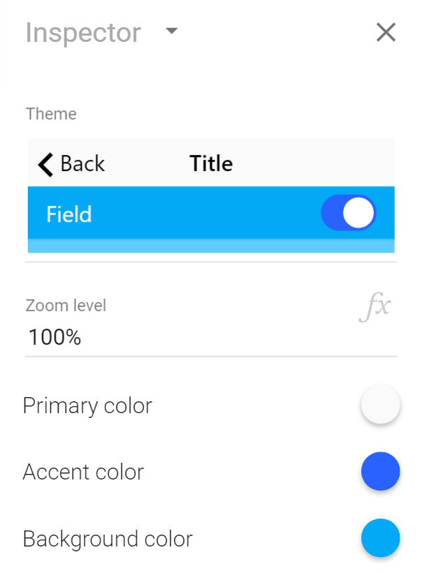
Calcapp enables you to set custom colors for your apps by changing just three colors: the primary color, the accent color and the background color. Colors you set for one panel also affect the panels that follow it, unless you give these panels explicit colors. As a result, setting the colors of your app’s first panel effectively sets the colors for all panels.
These colors don’t affect all areas of your app, though, such as the loading screen that appears when you start your app. Our latest release gives you the ability to set app-wide colors through the start screen we introduced last month. The primary color you set here is not only used for the navigation bar of your panels but is also used for the background color of your loading screens. Similarly, the accent color set on the start screen affects not just the appearance of switch fields, but is also used for the progress indicator of your loading screen.
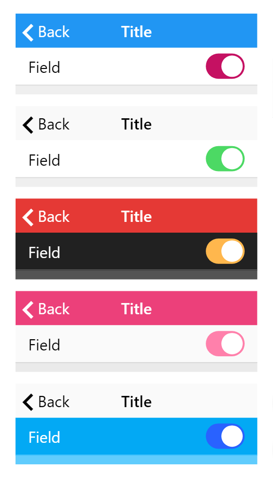
We’re also adding a color theme selector which makes it easy to experiment with color. Choose one of the five pre-defined themes or change a color and watch the theme preview update instantly:
Existing apps are not affected by this change. If you have already assigned colors to your first panel, these are the colors that will be used, not the colors you set on the start screen. The start screen colors are only used if there are no explicit colors set for your panels (meaning that the color is displayed as the symbol).
We’re introducing a few color themes to encourage you to experiment with the colors of your app. Calcapp uses a color system that takes its cues from the primary, accent and background colors, inferring other colors from them. That means that you only need to change these three colors to completely change the appearance of your app.
The first theme is the default theme, which has been with Calcapp since its inception. The second is designed to more closely mimic Apple’s iOS aesthetic. The third theme demonstrates a black background, the fourth a gray background with an eye-catching primary color and the last theme shows off a blue background.
There are actually three more so-called base colors, besides the primary, accent and background colors. These are available in the More colors section of the inspector. We don’t think you’ll want to change them very often, though. The Foreground, light color is used for text on a dark background and the Foreground, dark color is used for text on a light background. The color for Warnings is used for error messages when fields fail validation.


